Product designer · brand and interface · UK proptech
MovinReady
Renting a new build without an agent, an agency fee, or a middleman. A rebrand and a full redesign, from the mark to the design system.
- Role
- Sole designer
- Team
- Founder, marketer, developer
- Timeline
- Oct 2024 — Jun 2025
- Tools
- Figma · variables and components · HTML prototypes
- Status
- Partly live
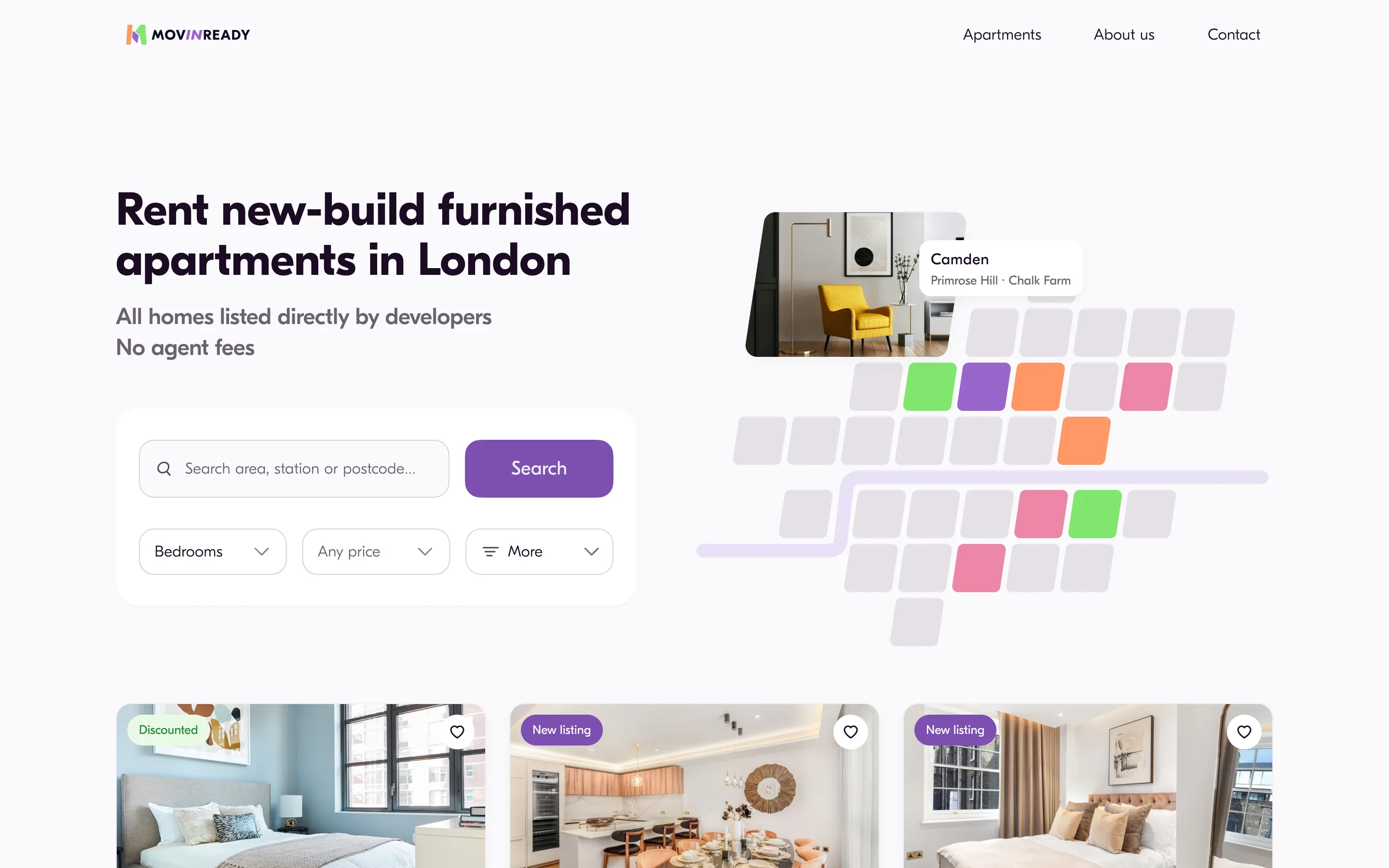
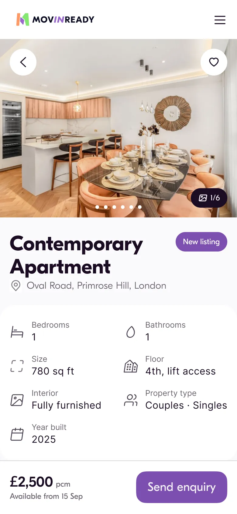
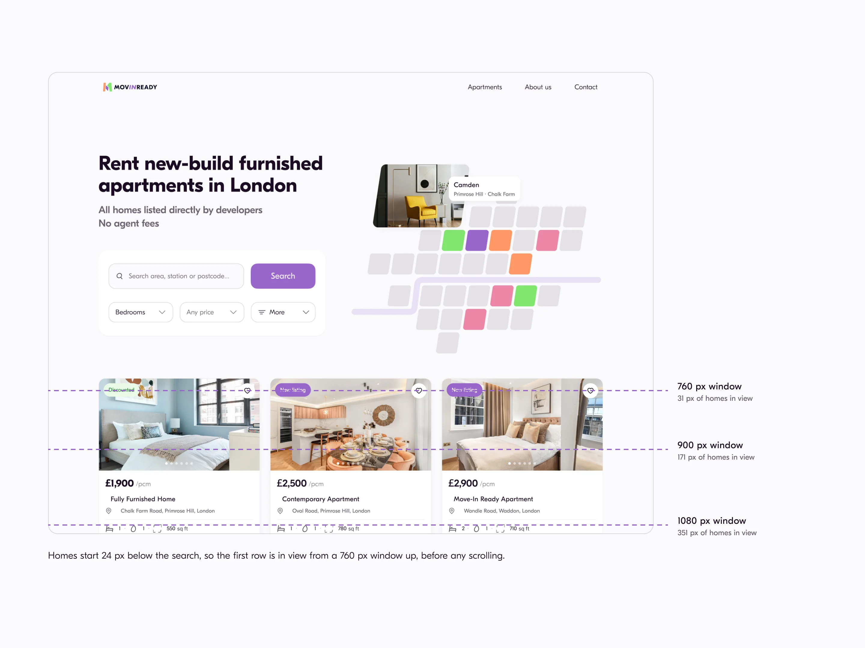
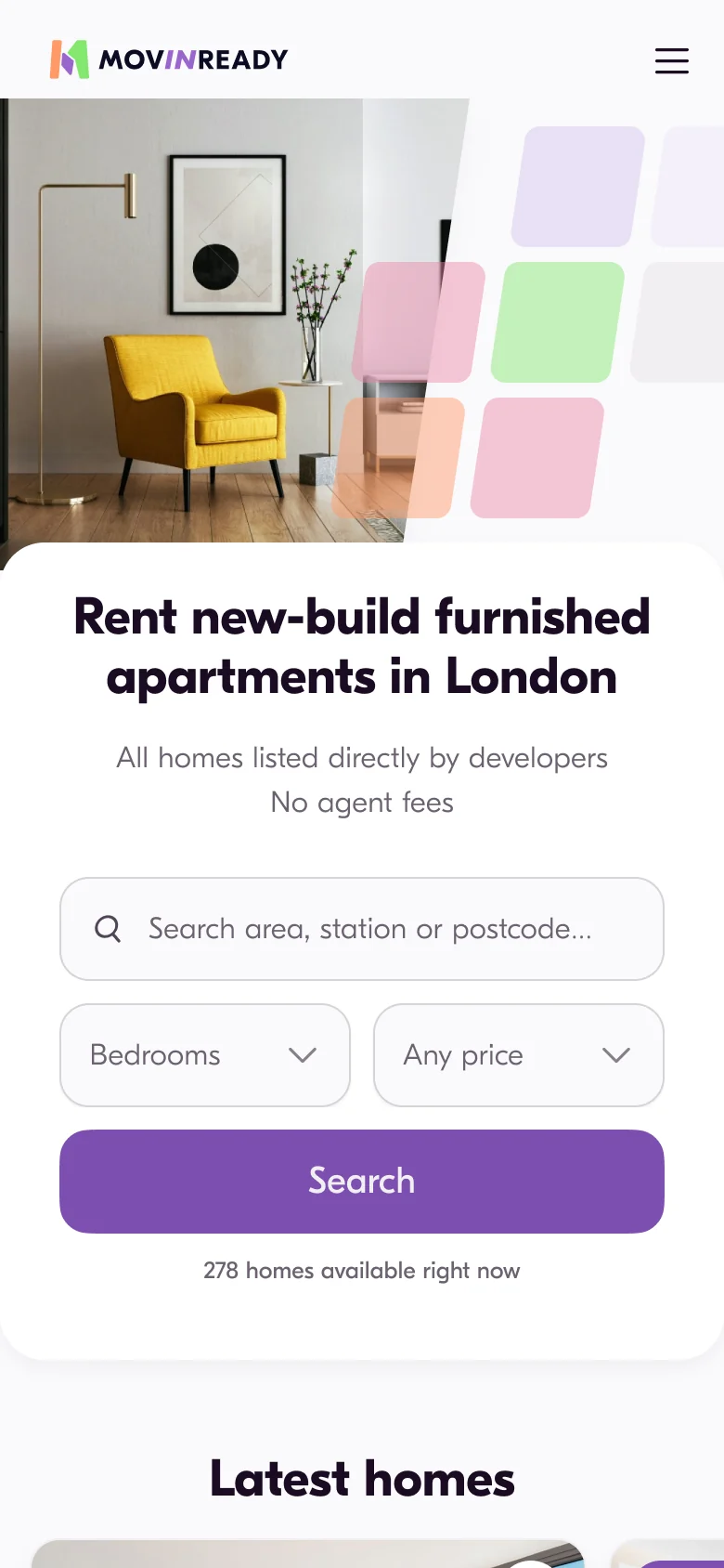
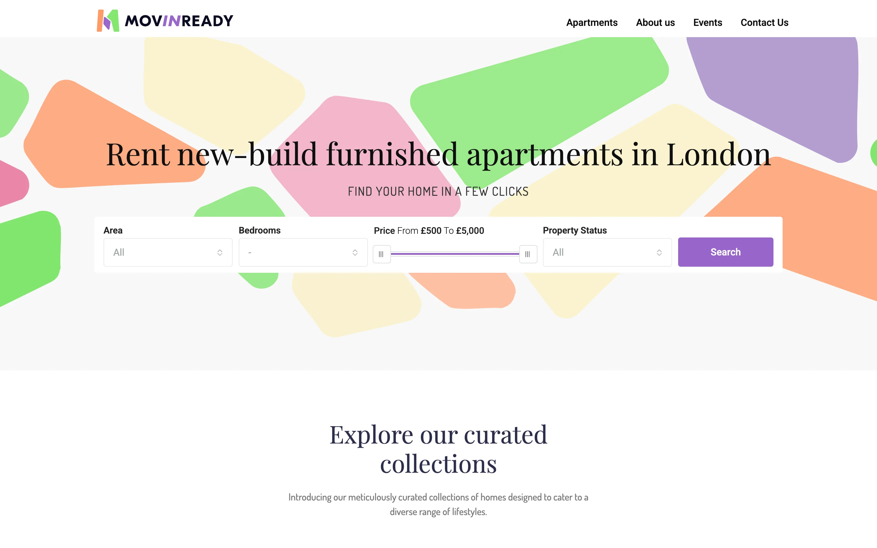
The homepage and a property page, both at the same scale.
- Made the brand: the mark is three London boroughs, and the 0.15 slant it is drawn with became the rule the whole interface keeps.
- Measured the old price slider at £16.60 a pixel — £2,000 was not a value anyone could land on. Replaced it with a panel you can type into.
- Designed the mobile site that did not exist. Five desktop pages became ten, on one grid, every control 56 px.
- Built the design system: 34 components, 84 variables, 99.8 % of fills bound to a role.
- Raised the main button from 3.58:1 to 5.05:1 in one edit, across every page, by moving a semantic role.
- Ran the first user test the project ever had — 10 responses, 4 hypotheses, predictions written down first.
- Not mine: the build. The site shipped on WordPress by a developer, and not all of it arrived.
Switch to Detailed for the measurements behind each line.
What I did
- Made the brand — the mark, the identity, the illustration set and the printed collateral. Won on an open contest against about 100 entries
- Designed the whole site: five desktop pages and the five mobile ones that did not exist, on one grid
- Built the design system inside the project — 34 components, 84 variables, 99.8 % of fills bound to a role
- Rebuilt the weakest control of the product after measuring the old price slider at £16.60 a pixel
- Ran the first user test the project ever had: 10 responses, 4 hypotheses, predictions written down first
- Took the interface from failing AA to passing — main button to 5.05:1, body text to 5.80:1, by moving one role
Not mine: the build. The site shipped on WordPress, by a developer, and not all of it arrived.
Conditions
- No research budget. The test was run by hand, on friends and the client base.
- No system to start from. The kit was built inside the project, while the pages were being drawn.
- The build was a commercial WordPress theme, so every decision had to survive what the theme allowed.
Nobody said what the product was.
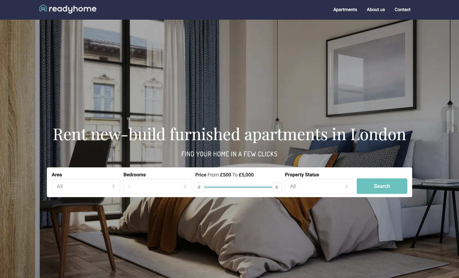
The old site opened on a photograph of a bedroom and the line Find your home in a few clicks. That sentence fits any rental site on the internet. The one thing that made this one different — no agent, no agency fee — was not on the first screen at all.
Two more things were checkable, so I checked them: the price filter was a bare track from £500 to £5,000 with no field to type in, the address under every home came straight from a geocoder at 120 characters, and one row of the results list stood 226 px tall with 647 px of empty width inside it — so a laptop screen held four homes.
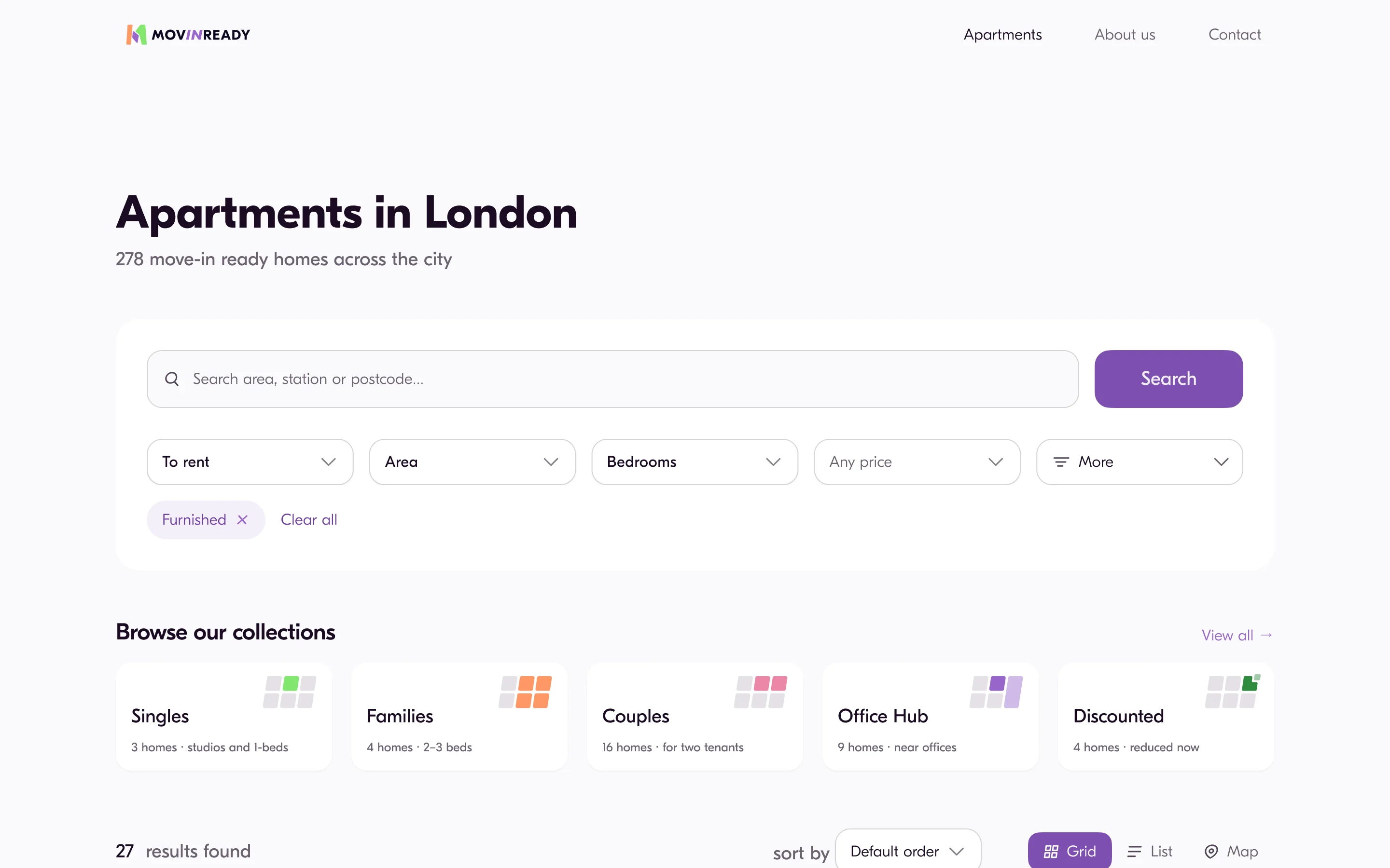
And the first screen closed instead of handing over. The hero ended, the background changed colour across the full width, and the next section started with a centred heading about collections — so on a laptop the page looked finished before it had shown a single home.
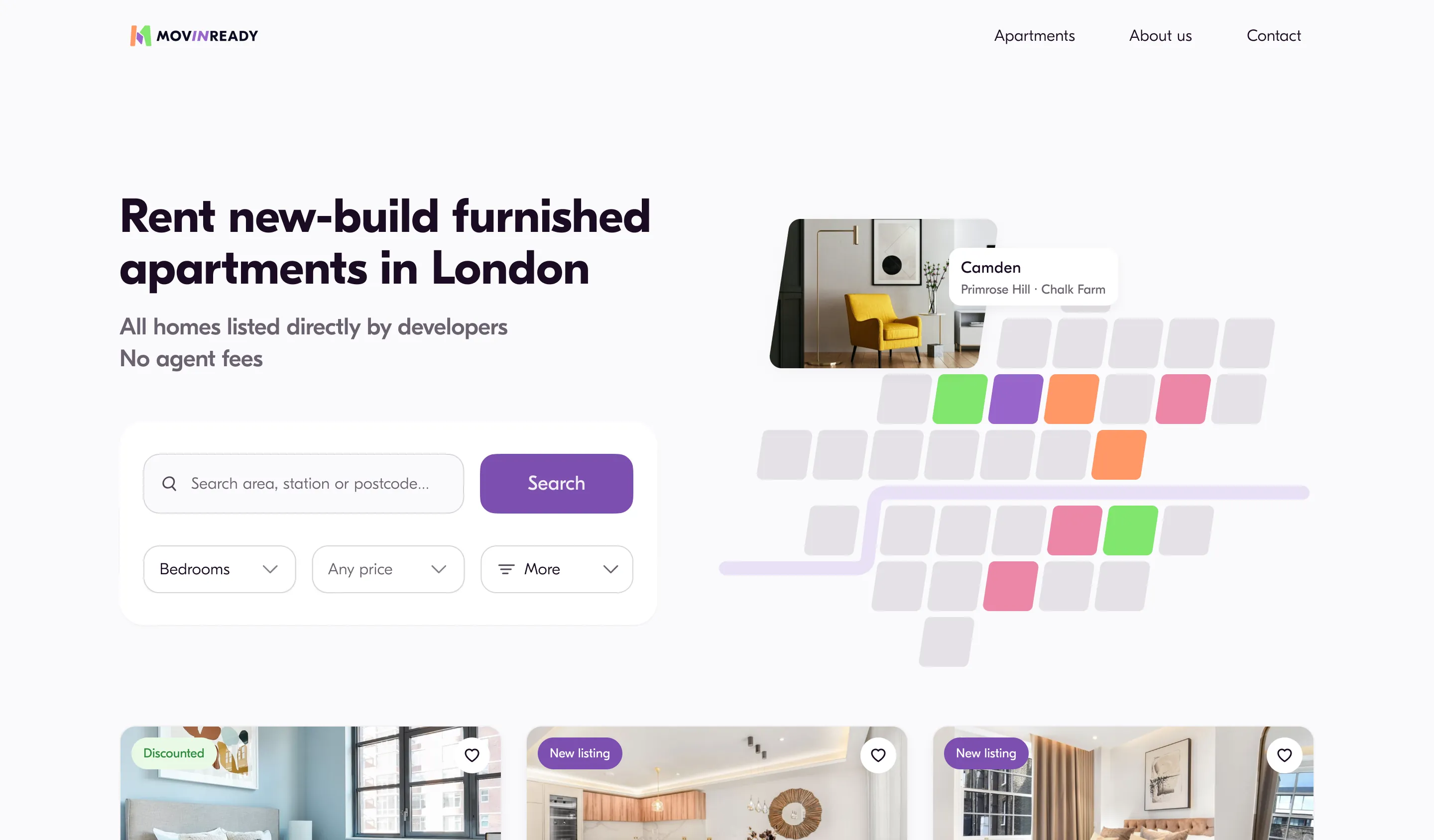
The mark is three London boroughs.
Not an abstraction. I started from the map of London, took three neighbouring boroughs and leaned them over — so the mark is a piece of the city, not a shape that could belong to any rental brand.
Three patches, and the number is not decoration. A move has three parts — the old place, the search, the home at the end of it — and the mark names them: the search is the middle patch, which is where the brand purple sits, and the last one is green.
The word says it again. The name is the phrase move in ready, so the lock-up breaks into Mov, in and Ready — and in is the only part that is purple and the only part that leans, exactly what the middle patch does.
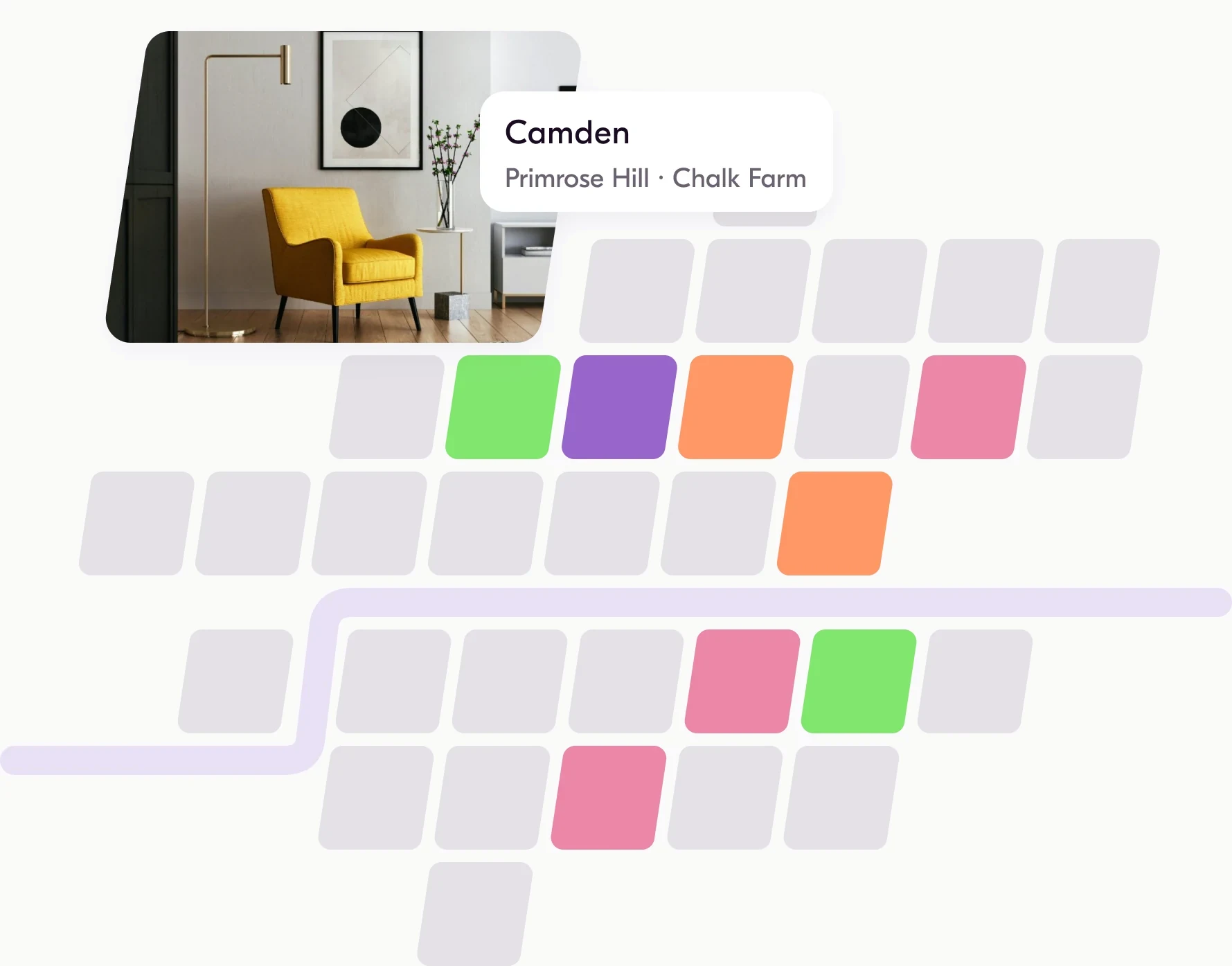
The map did not stay in the logo. It became the hero: 33 boroughs drawn to the same grid, the Thames between them, and the ones with homes lighting up one at a time. The mark and the first screen are the same drawing at two sizes.
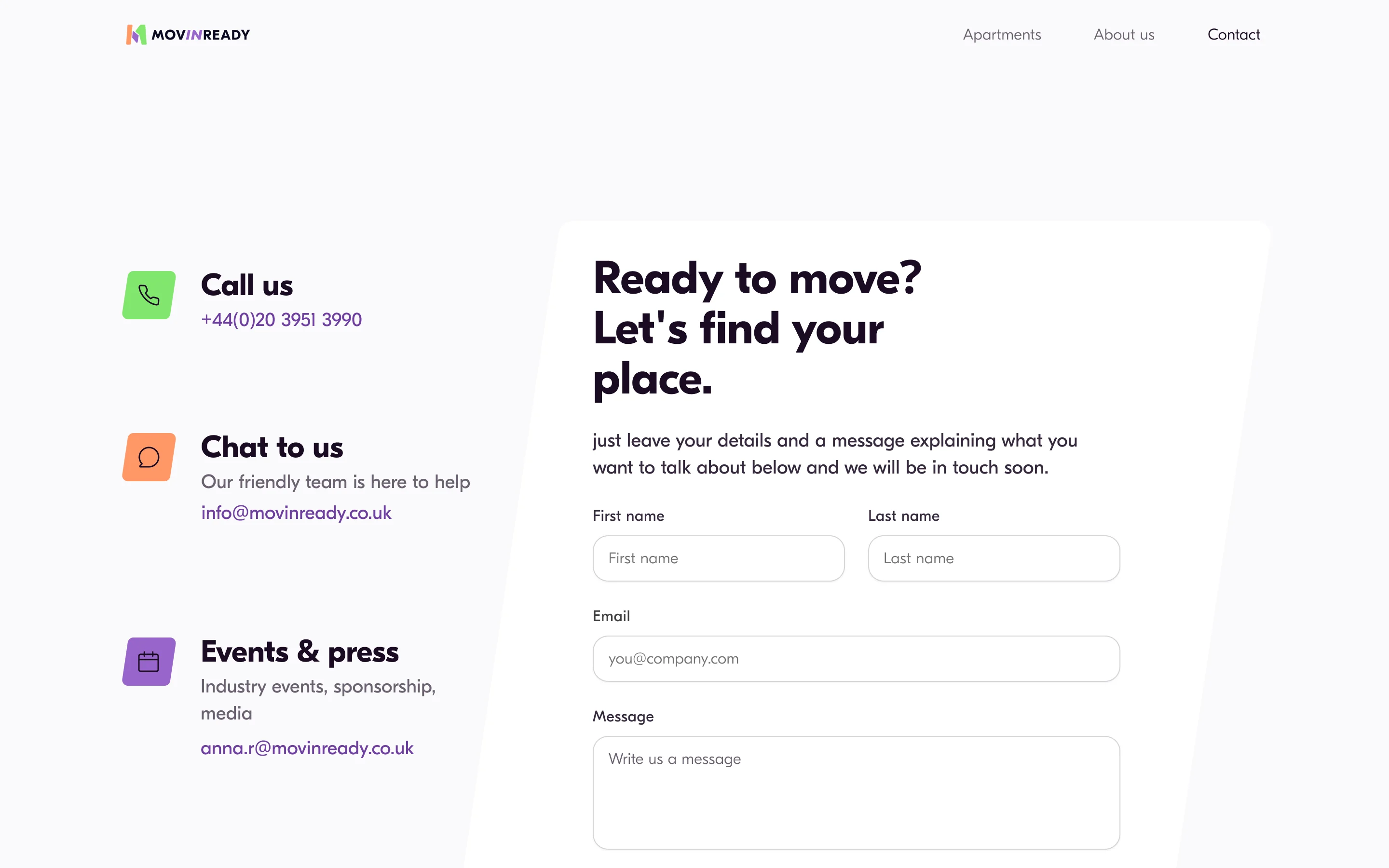
From there it turned into a rule the interface could keep: every brand object slants by exactly 0.15 of its own height — a 50 px borough on the map, the houses in the footer, the 826 px house the contact form sits inside. Change a height and the slant follows; nothing is measured twice.
The illustration direction was not mine. Alex, the developer, looked at three styles living on one page and said it made the product look cheaper — one is axonometric, one is a single line, one is flat and bold. He was right, and flat bold is the set that survived.
What the client got was not a mood board: a file with the colour and type directives for print and for the web, every value read back from the same tokens the interface uses.
The price: one rule means one look. A block that wants to be different cannot just be drawn differently — it either leaves the system or changes the slant for everything on the site at once. That is the whole point, and it is also the limit.


3Dflat boldone-line
Three directions on one board. Flat bold is the one that shipped.
The mark’s own grid, this time carrying content: six homes narrow to three, then to one.
The file still carries a pre-print number — the printed cards went out with the real one.
The price slider was fine.
At least that is what the old site assumed. It gave you a track from £500 to £5,000 and no way to type a number.
So I measured it. One pixel of that track was worth £16.60, which means £2,000 was not a value anyone could land on — you could only pass it.
The panel that replaced it opens under its own trigger at 368 × 296: a slider to browse with, Min and Max as fields to type into, and a counter that moves with the number.
The price: a panel costs one click to open. The slider cost none — it just could not hit a round number.
One pixel of that track is worth £16.60. The numbers here demonstrate the control, they are not live data.
A piece of the product, running
A first screen should hand over, not close.
So homes cross the fold. The hero moved up one step of the scale and a row of three properties begins at 729, which puts 31 px of it on screen at 760 visible pixels and 171 at 900.
Nothing explains this product faster than the homes it has, so the homes go first and the arguments follow.
The price: the trust arguments — why us, no fees — moved further down. Homes earn a scroll; sentences do not.
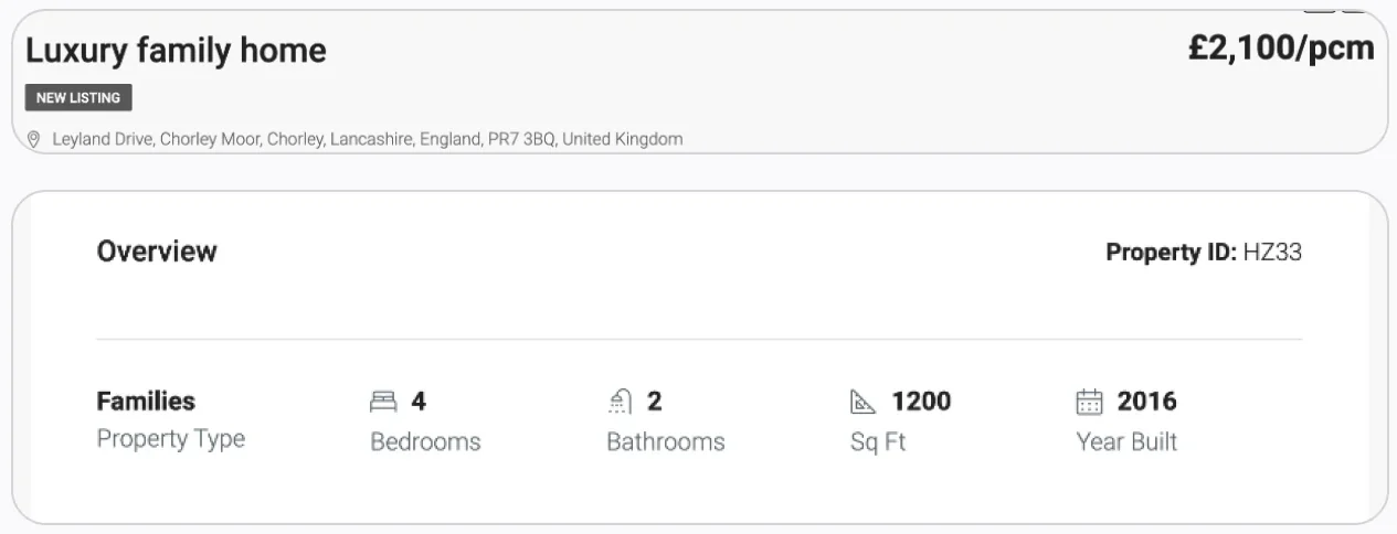
Seven facts, printed three times.
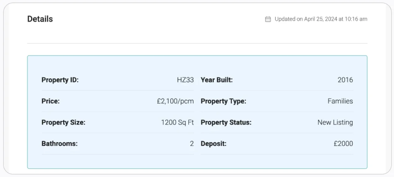
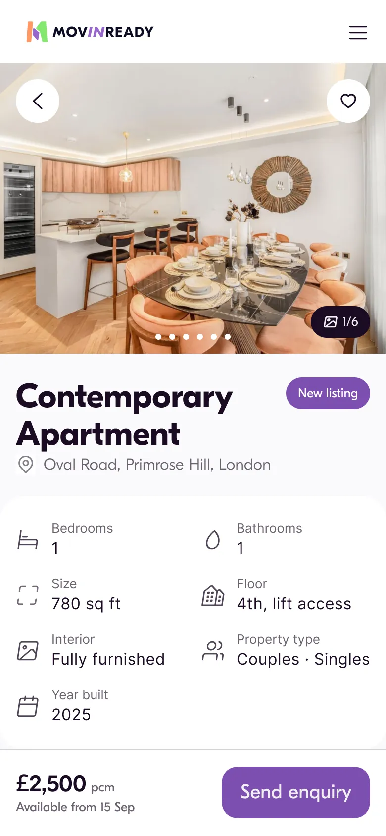
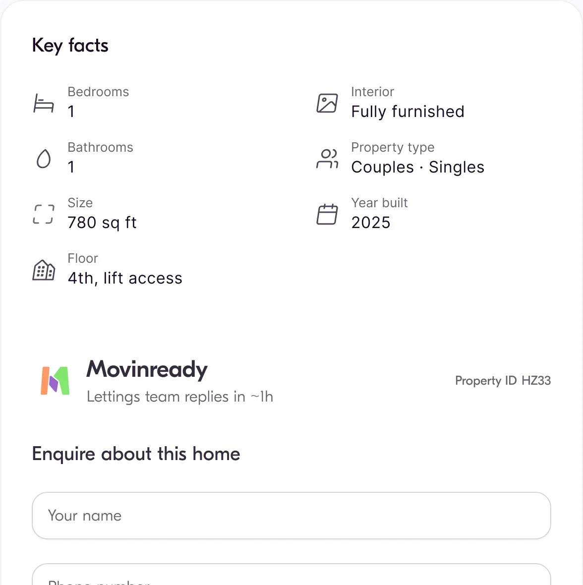
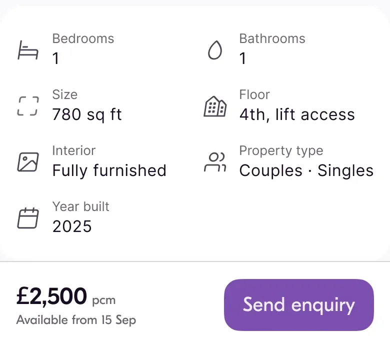
Bedrooms, bathrooms, size and floor appeared in the header, again in the Overview table, and a third time in Details further down the same page. Seven facts printed three times, and the page still left 758 px of empty right column below the form.
Now each fact appears once, where that question is actually asked: price and terms by the price, what the home is in Key facts, what is inside in Features, where it is in the map block. The gap between the columns went from 842 to 20.
The price: a 588 + 588 grid puts the reading column at 82 characters, above the 66 that is comfortable. It is the same measure as the rest of the site, so nothing drifts.
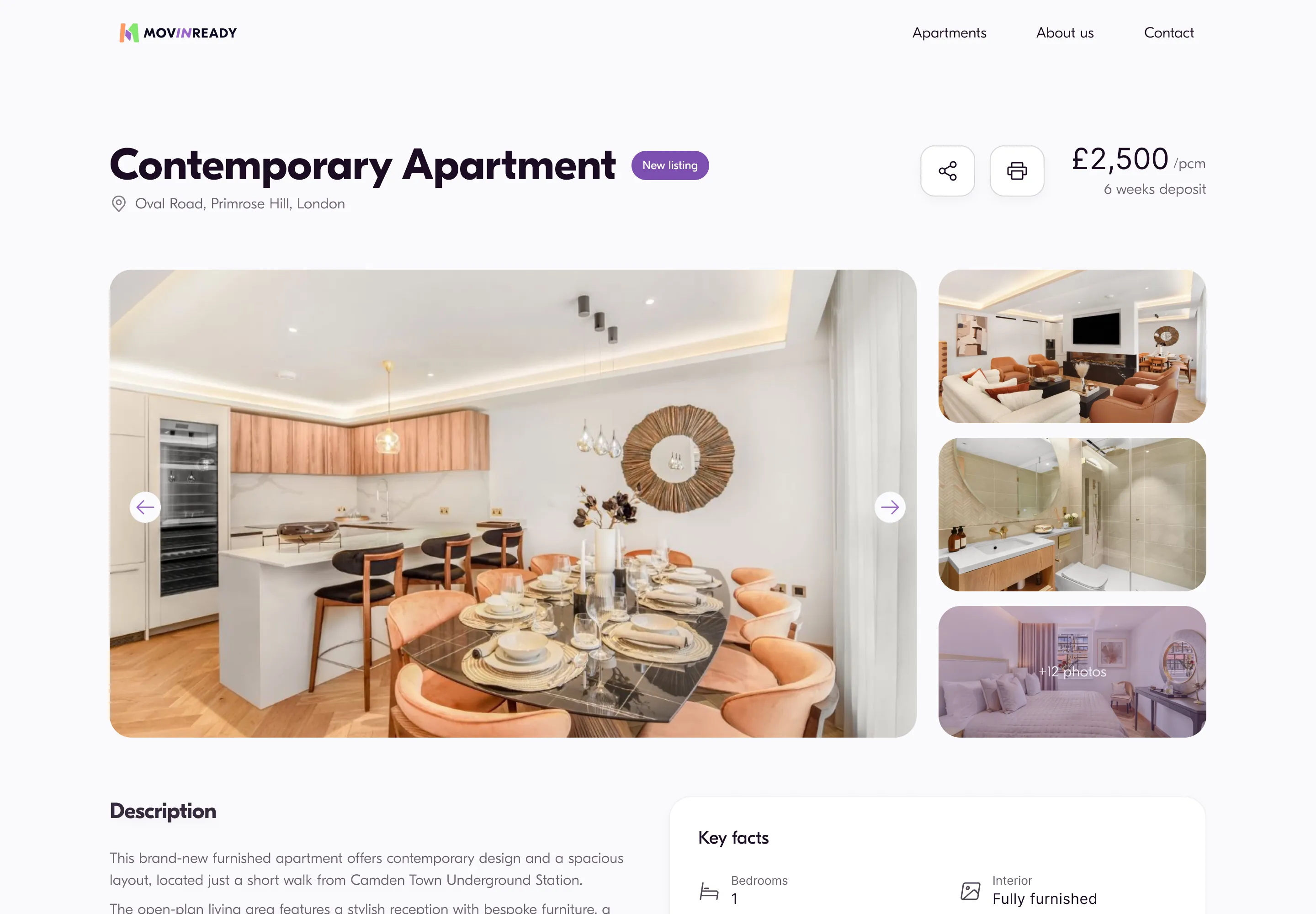
Any frame opens full screen — the whole page, close enough to read.
There was no mobile design.
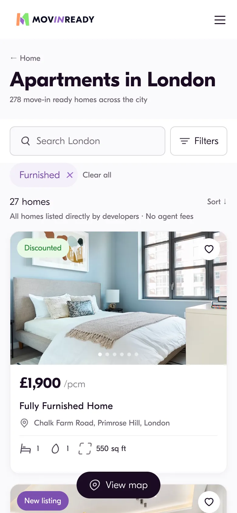
Which was awkward, because most of the traffic was phones. The file had five desktop pages and nothing after that.
Alex, the developer, framed it before I had drawn anything: landscape on desktop, portrait on a phone — two layouts, not one that stretches. So the mobile pages are the same content re-cut, never the desktop ones scaled down.
Every control on a phone is 56 px tall — one comfortable tap target, decided once and never argued about again.
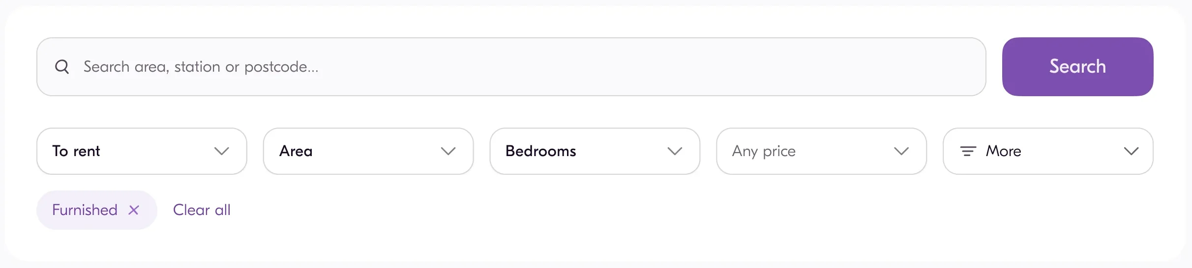
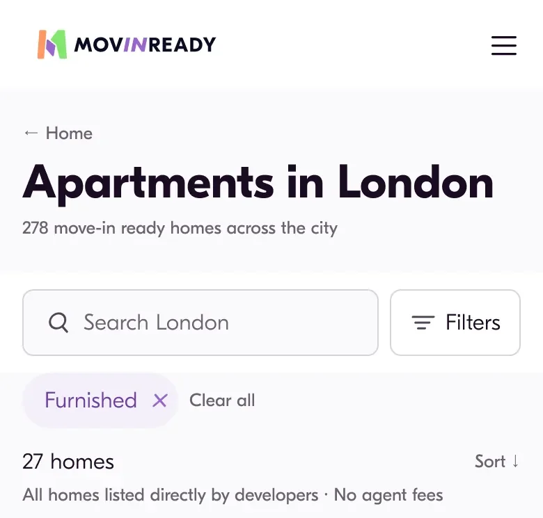
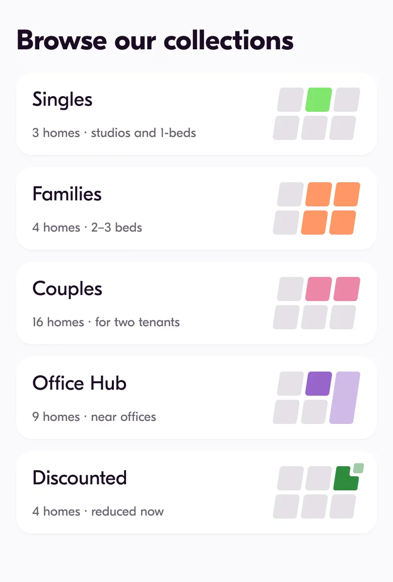
Three of the re-cuts are decisions, not translations. The filter row lost its horizontal scroll — a row that runs off the edge hides half of what it holds. The collections stopped being a carousel: five of them are navigation, and navigation has to be visible at once. And the enquiry form, a sidebar on desktop, became a sticky bar — the one action of the page should not scroll away.
The footer was a fourth, and the one I got wrong first. I fixed three defects in it one after another, each of them adding height, and never checked the total until it stood at 680 px on an 844 px screen. Re-cut, it came back to 374.
The price: five more pages to keep in sync, forever.

Taste is not a measurement.
Every colour decision here has a ratio behind it. The main button — Search, Send enquiry, Apply — sat at 3.58:1 against the 4.5 that AA asks for 20 px text. Moving one semantic role from purple/500 to purple/600 took it to 5.05:1 everywhere at once.
Body text was the same story at 3.87:1. It went to 5.80:1, and the step was chosen rather than maximised: the darkest grey would have matched the primary text and flattened the hierarchy it was supposed to sit under.
Decisions were checked with people too — ten responses, four hypotheses, and the predictions written down before the answers came in. Two of them changed the file. The postcode in every address became the city — three readers in ten had read NW1 as NWI, because the digit 1 in this typeface is a bare stroke — and the size on a card got its unit back.
The price: the test was run by hand, on friends and the client base. It shows direction, not percentages, and it is written that way wherever the numbers appear.
- Send enquiry—:1— · Main button · 20 px · needs 4.5
— - All homes listed directly by developers—:1— · Body text · 13 px
— - info@movinready.co.uk—:1— · Links · 16 px
—
— px tall · — · the map pill on the mobile address block, against the 44 Apple asks for
A piece of the product, running
A concept starts with a diagnosis, not an idea.
Four steps, every round. Say in one sentence of facts what is not working. Change what the object is, not how it is decorated. Give it one prohibition, because a limit holds a concept together where another element only fills it. Then put up two or three versions that differ in meaning, each carrying the thing it gives up.
Skip the first step and nothing downstream can save the round. The contact page went through four of them before one worked, and all four answered the wrong question — what goes in the empty left column — because every one of them was invented out of our own kit, with no look outward.
The diagnosis came from five competitors: at Get Living, Quintain Living and Blueground the message form is not the main object of a contact page at all. Ours gave it two thirds of the first screen and squeezed the two real ways to reach a person into a sidebar. The round that worked reframes the form as a brand block, and its prohibition is that not one separate cell is left anywhere on the page.
The price: the method is slow, and it is meant to be. Four rounds on one page is four rounds thrown away, and the only thing that made them refusable was writing down what each one gave up.
The file had to keep working without me.
So nothing inside it points at a value. Four layers — a primitive, a semantic role, a component, a screen — and a screen points at a role, never at a colour.
That is what made the button fix earlier one edit and not a sweep: one role moved, and every page followed it. On the five desktop pages 99.8 % of fills and 100 % of UI radii resolve through that chain, so there is almost nothing left for a change to miss.
What went to the client was not a folder of screens. The kit is a library in the file — 34 components, 84 variables in four collections — so a change to a master reaches every page that uses it.
The documentation is generated from the kit rather than written beside it. The showcase page prints each component’s own description and property list and counts them as it builds, so it cannot drift from the library it reads.
Every component also carries the part that cannot be drawn, written in English because the person opening it in Dev Mode is the developer in London. The press contract is one of them — hover only where there is a real pointer, press scale(0.97) over 160 ms, and the return faster than the press.
The sticky header is another: two triggers rather than one, fixed rather than sticky. Where a rule was easier to show than to write, it went over as a working HTML prototype.
Type has two modes, Desktop and Mobile, so a phone artboard switches a mode instead of restyling every heading — and the same values live in tokens.css, which is how the chain survives the trip out of Figma.
The price: four layers is one more than anyone wants to learn, and a contract in a description is only as good as the person who opens it. Both pay for themselves the first time a value has to move.
- purple/500#9866CB
- purple/100#F4EFFA
- purple/050#F8F5FB
- grey/000#FFFFFF
- grey/025#FBFAFC
- grey/050#F1EEF2
- grey/200#D6D3D9
- grey/400#BBB7BF
- grey/450#A09AA5
- grey/500#867F8B
- grey/600#514557
- grey/550#6C6271
- grey/800#36293D
- grey/900#1B0C23
- cream/500#FAF2CF
- green/500#82E66F
- tangerine/500#FF9866
- pink/500#EB87A7
- purple/600#7D4FB0
- purple/700#6E3FA0
- green/100#E9F9E5
- green/700#2E8B3E
- grey/100#E4E1E6
- purple/200#E9E0F5
- purple/300#B591D8
- purple/900#482C6B
- text/primarygrey/900 ↗
- text/secondarygrey/550 ↗
- text/disabledgrey/400 ↗
- text/inversegrey/000 ↗
- text/accentpurple/500 ↗
- surface/pagegrey/025 ↗
- surface/cardgrey/000 ↗
- surface/fieldgrey/025 ↗
- surface/field-hoverpurple/050 ↗
- surface/selectedpurple/100 ↗
- surface/inversegrey/900 ↗
- border/defaultgrey/200 ↗
- border/hovergrey/400 ↗
- border/activepurple/500 ↗
- accent/primarypurple/500 ↗
- status/newpurple/600 ↗
- status/discountedgreen/500 ↗
- accent/hoverpurple/700 ↗
- surface/hovergrey/050 ↗
- surface/inverse-hovergrey/800 ↗
- surface/disabledgrey/200 ↗
- status/new-surfacepurple/100 ↗
- status/new-inkpurple/700 ↗
- status/discounted-surfacegreen/100 ↗
- status/discounted-inkgreen/700 ↗
- accent/pressedpurple/900 ↗
- surface/pressedgrey/100 ↗
- surface/inverse-pressedgrey/600 ↗
- surface/field-pressedpurple/100 ↗
- surface/selected-pressedpurple/200 ↗
- text/linkpurple/700 ↗
- accent/fillpurple/600 ↗
- space/44
- space/88
- space/1212
- space/1616
- space/2424
- space/3232
- space/4848
- space/6464
- radius/field8
- radius/card16
- radius/panel24
- radius/pill999
- radius/xs4
- radius/small12
- opacity/soft45 %
- opacity/faint20 %
- heading/XL/size48 · 34
- heading/L/size32 · 28
- heading/M/size24 · 24
- heading/M/line32 · 28
- heading/L/line36 · 32
- heading/XL/line52 · 38
- heading/S/size20 · 20
- heading/S/line28 · 26
- heading/2XL/size78 · 38
- heading/2XL/line84 · 42
26 in this collection · 84 variables in four, and nothing on a screen points at a colour
What shipped is not what was designed.
The site went live on WordPress with a commercial theme. The mark made it. The accent made it. The illustrations made it.
The typeface did not — production runs Roboto and Playfair Display. The headline font was changed on the live site and changed back the same week, and both calls were made in the chat, not in the file. GT Eesti is a paid licence, and the brand file named the free stand-ins for exactly that case — Nunito Sans and Poppins. Production uses neither, and the address is still a 120-character geocoder string against 32 in the design.
What I cannot show is an effect. The site had no analytics, and the project stopped before the rest of the design could ship — so the honest numbers here are the ones I measured in the file and in the test, not a conversion rate I did not have access to.
The price: a case that stops at the file is easier to look at. This one has to carry the gap between the two, and that gap is part of the job.
A person, not a process.
It began as a logo contest. About a hundred people entered, I won it, and the job kept growing until it was the mark, the identity, ten pages and the system underneath them.
Three other people, and each of them changed something here. Kate, the founder, had the final word on the brand and used it in specifics rather than adjectives — which thing, what to change. That is the fastest kind of feedback there is.
The marketer brought what the market was actually asking for, and the business cards and the pitch decks were argued out with them line by line rather than handed over.
Alex, the developer, said what the theme would allow before I had drawn anything. That is the only reason the mobile pages were re-cut rather than stretched.
I measure because I do not trust my own eye. I have been wrong often enough to write it down, and three of those mistakes are in this case, each with the number that caught it.
The rest comes from outside the file. I read about cities — how a borough map gets drawn, why a street grid tilts, what makes a place readable from above — and that is where the mark came from, not from a folder of other rental sites.
Most decisions here began as a question I could not answer. Why is this number this number, what is this block for, who is this screen even talking to. The answer is usually duller than the idea I started with, and better.
Four things I am taking to the next project.
- Measure the thing before arguing about it. One pixel of the old price track was worth £16.60, so £2,000 was a number you could only pass — and no amount of taste would have settled that.
- Make the geometry a formula, not a value. Every brand object leans 0.15 of its own height, from a 50 px borough to the 826 px house the contact form sits in; change a height and the slant follows on its own.
- Bind the role, not the colour. Moving one semantic role took the main button from 3.58:1 to 5.05:1 on every page at once — four layers paid for themselves the first time a value had to move.
- Name what a concept gives up before showing it. The contact page took four rounds, and the only reason the first three could be refused is that each one carried its sacrifice in writing.
Yes, I definitely like them!!! We might refine a little, but that is tomorrow. Well done — and a fast turnaround!!!